Advanced Data Visualisation with Pandas Profiling
Visualisation is the cornerstone of EDA. When facing a new, unknown dataset, visual inspection allows us to get a feel of the available information, draw some patterns regarding the data, and diagnose several issues that we might need to address. In that regard, Pandas Profiling has been the indispensable swiss knife in every data scientist’s tool belt. Its data profile report provides a comprehensive overview of datasets characteristics and summary statistics but more impressively, highlights potential data quality problems which we definitely don’t want to let sneak into the machine learning models unchecked.
However, something that seemed to be missing was the ability to compare different reports side-by-side. This has actually been a major feature requested by the community for the past few years, due to the shared pain of having to manually compare profile reports to assess data transformations and quality improvements.
When you're profiling data and have a report, later down the line you might have to re-profile that same data to see how the data has progressed. This includes going through both reports and manually comparing the difference between them. A nice solution to this would be a system to compare two reports to highlight and outline the differences between the reports in terms of how the data is being transformed.
Great news for you data-centric lovers: the wait is over! Pandas Profiling now supports a ‘side-by-side’ comparison feature that lets us automate the comparison process with a single line of code. In this blogpost, We’ll put you up to speed with this new functionality and show you how we can use it to produce faster and smarter transformations on our data.
The dataset used in this article can be found in Kaggle, the HCC Dataset. For this particular use case, I’ve artificially introduced some additional data quality issues to show you how visualisation can help us detect them and guide us towards their efficient mitigation. All code and examples are available on GitHub and in case you need a little refresher, make sure to check this blog to dust off your pandas-profiling skills. So, on with our use case!
Pandas Profiling: EDA at your fingertips
We’ll start by profiling the HCC dataset and investigating the data quality issues suggested in the report:
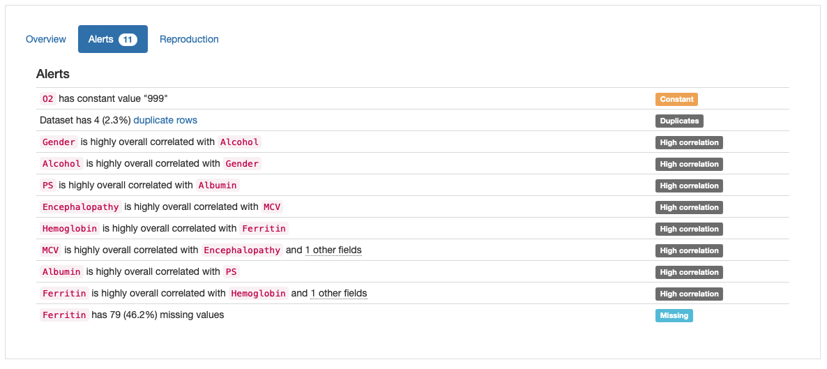
Alerts shown in Pandas Profiling Report
According to the “Alerts” overview, there are four main types of potential issues that need to be addressed:
-
Duplicates: 4 duplicate rows in data;
-
Constant: Constant value “999” in ‘O2’;
-
High Correlation: Several features marked as highly correlated;
-
Missing: Missing Values in ‘Ferritin’.
The validity of each potential problem (as well as the need to find a mitigation strategy for it) depends on the specific use case and domain knowledge. In our case, with the exception of the “high correlation” alerts, which would require further investigation, the remaining alerts seem to reflect true data quality issues and can be tackled using a few practical solutions:
Remove Duplicate Rows: Depending on the nature of the domain, there might be records that have the same values without it being an error. However, considering that some of the features in this dataset are quite specific and refer to an individual’s biological measurements (e.g., “Hemoglobin”, “MCV”, “Albumin”), it’s unlikely that several patients report the same exact values for all features. Let’s start by dropping these duplicates from the data:
Removing Irrelevant Features: The constant values in O2 also reflect a true inconsistency in data and do not seem to hold valuable information for model development. In real use case scenarios, it would be a good standard to iterate with domain or business experts, but for the purpose of this use case example, we’ll go ahead and drop them from the analysis:
Missing Data Imputation: As frequently happens with medical data, HCC dataset also seems extremely susceptible to missing data. A simple way to address this issue (avoiding removing incomplete records or entire features) is resorting to data imputation. We’ll use mean imputation to fill in the absent observations, as it is the most common and simple of statistical imputation techniques and often serves as a baseline method:
Side-by-side comparison: faster and smarter iterations on your data
Now for the fun part! After implementing the first batch of transformations to our dataset, we’re ready to assess their impact on the overall quality of our data. This is where the pandas-profiling compare report functionality comes in handy. The code below depicts how to get started:
Here’s how both reports are shown in the comparison:
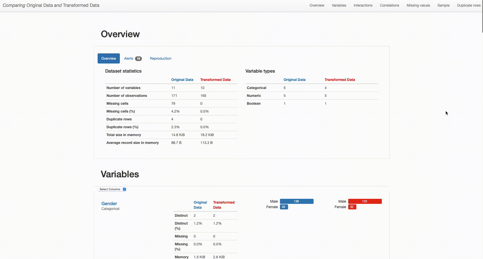
Comparing Original Data and Transformed Data
The comparison report shows both datasets (“Original Data” and “Transformed Data”) and distinguishes their properties by respectively using blue or red color in titles and graph plots. By analysing both versions of the data ‘side-by-side’, we can perform a simpler and smarter assessment of the differences between them, and quickly identify situations that require further attention. With that in mind, I’ll dive deeper into the comparison between the original and transformed datasets to investigate the impact of each of the performed transformations in higher detail.
Dataset Overview: The transformed dataset contains one less categorical feature (“O2” was removed), 165 observations (versus the original 171 containing duplicates), and no missing values (in contrast with the 79 missing observations in the original dataset).

Comparison Report: Dataset Statistics (Image by author)
Duplicate Records: Conversely to the original data, there are no duplicate patient records in the transformed data: our complete and accurate case base can move onward to the modeling pipeline, avoiding data overfitting.

Comparison Report: Duplicate Rows (Image by author)
Irrelevant Features: Features that have not been subjected to any transformation remain the same (as shown below for “Encephalopathy”): original and transformed data summary statistics do not change. In turn, removed features are only presented for the original data (shown in blue), as is the case of “O2”.

Comparison Report: Encephalopathy remains the same (Image by author)

Comparison Report: O2 is only shown for the original data (Image by author)
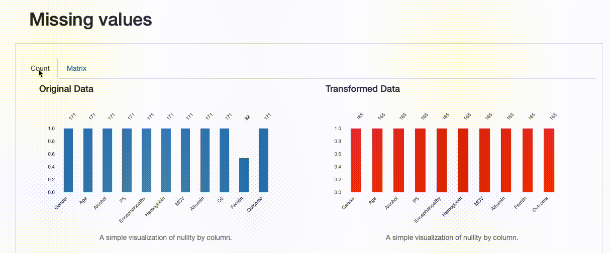
Missing Values: Contrary to the original data, there are no missing observations after the data imputation was performed. Note how both the nullity count and matrix show the differences between both versions of the data: in the transformed data, “Ferritin” has now 165 complete values and no blanks can be found in the nullity matrix.
Comparison Report: Missing Values
However, something else is insightful from the comparison report in what concerns missing data. If we were to inspect the “Ferritin” values in higher detail, we’d see how imputing values with the mean has distorted the original data distribution, which is undesirable:
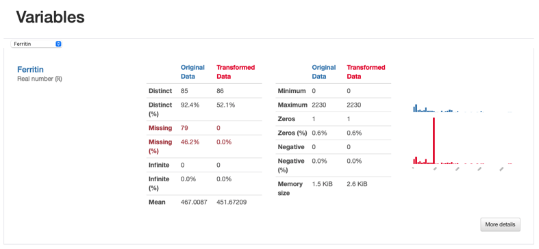
Comparison Report: Ferritin - imputed values seem to distort the original feature distribution
This artifact is also observed through the visualisation of interactions and correlations, where daft interaction patterns and higher correlation values emerge in the relationship between “Ferritin” and the remaining features.
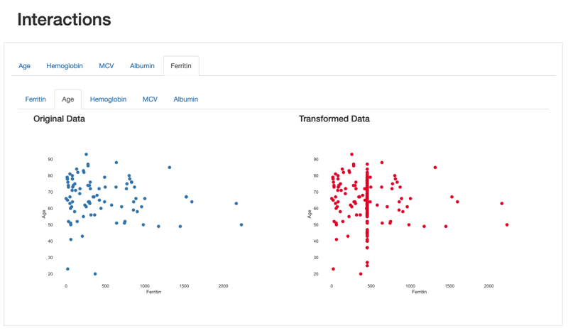
Comparison Report: Interactions between Ferritin and Age: imputed values are shown in a vertical line corresponding to the mean
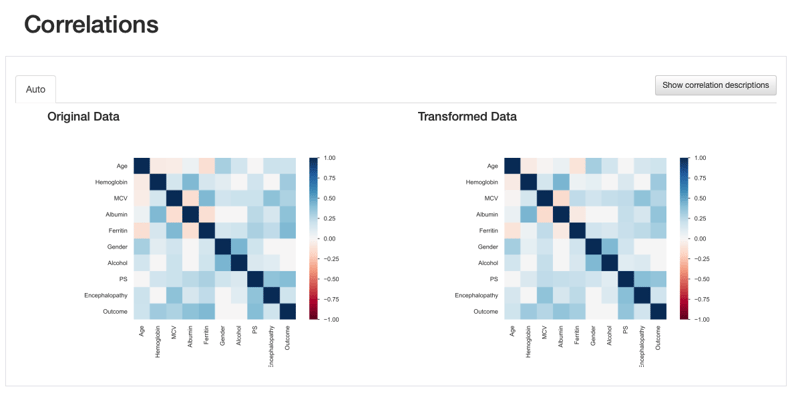
Comparison Report: Correlations - Ferritin correlation values seem to increase after data imputation
This comes to show that the comparison report is not only useful to highlight the differences introduced after data transformations, but it provides several visual cues that lead us towards important insights regarding those transformations: in this case, a more specialised data imputation strategy should be considered.
What’s in sight: additional use cases
Throughout this small use case, we’ve covered the usage and potential of side-by-side comparisons to highlight data transformations performed during EDA and evaluate their impact on data quality. Nevertheless, the applications of this new feature are endless, as the need to (re)iterate on feature assessment and visual inspection is vital for data-centric solutions. To spark your creativity, I’ll leave you with a few where I believe side-by-side comparison would have the most impact:
-
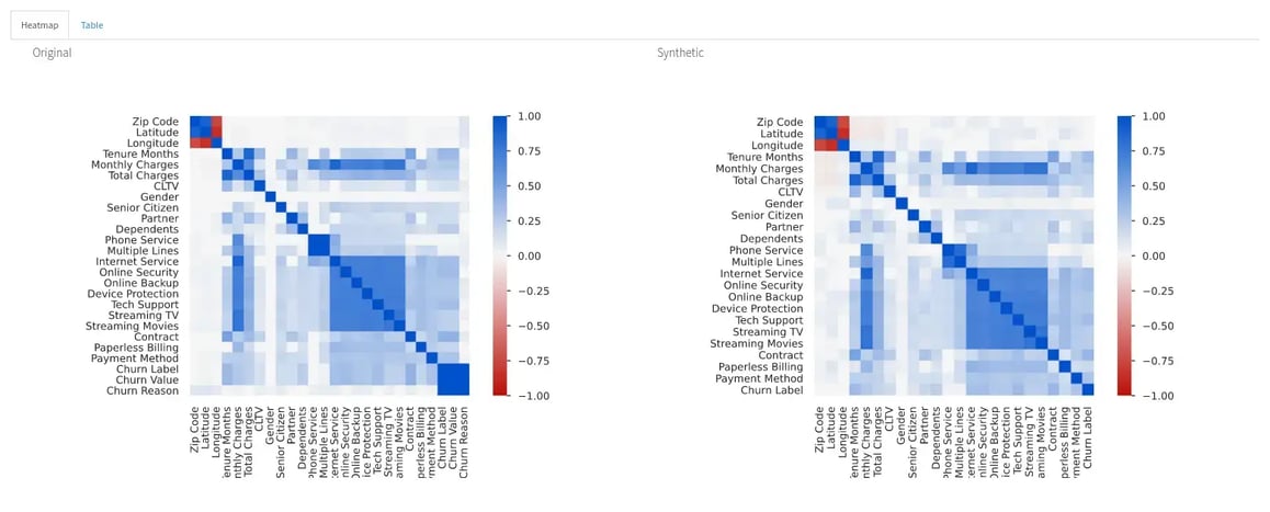
Data Fidelity: Comparing the properties of synthetic versus “real” data could be detrimental to investigating how synthetic data can capture complex relationships and embody the characteristics of “real” data.
-
Data Resampling: When class imbalance or underrepresented concepts in data are at state, under- or oversampling are two key techniques to produce a balanced training set. Comparing the properties of the reduced/augmented data with the original data could be a starting point to decide on multiple possible strategies. The same is applicable when a smaller or larger sample of data is required irrespectively of data imbalance issues.
-
Dataset Shift: Dataset shift (commonly probability and covariate shift) is often introduced when dividing data into training and test sets. A comparison between their properties would be key to identifying the artificial introduction of these types of biases. Again, regardless of potential shifts, machine learning pipelines often require the comparison between training and test datasets, where ’side-by-side’ comparison is overall a welcomed feature. For some applications, it could also be insightful to check the properties of data in a fixed time window (e.g., 2021 versus 2022). Given enough data, some insightful patterns may emerge.
Have you used this new functionality yet? Let us know if you find additional use cases for it. And if after so much cleaning and iteration your data still looks like a "pandamonium" (yes, pun intended), maybe you should consider joining us at the Data-Centric AI Community and sharing some ideas on how Pandas Profiling could be further improved. May we could build them together?