Pandas Profiling was always mygoto-secrettool to understand the data and uncover meaningful insights, in a few minutes, under a few lines of code.
Whenever I was given a new dataset, I would generate a profiling report first and inspect the data. Only then would I start my exploratory data analysis phase. But as I used the library more, I learned some advanced usage which was very helpful for my projects as a data scientist.
In this article, first, we'll pick a simple use case, profile the dataset, dive deep into some of the less-known advanced features of the library, and explore how it can be used for your next project.
The Standard Usage Using a Simple Example
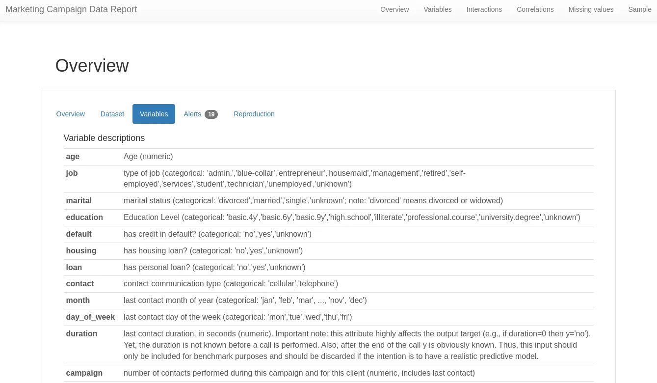
Let's pick a marketing campaign use case of a Portuguese banking institution. The data is about the direct marketing phone calls made by the bank to its customers, and our task is to predict if the client subscribes to a term deposit.
You can download the relevant data we'll be profiling from theUCI repository.
Let's fire up a conda environment called reporting-env and install the library. Specifying the version is a good practice as it will ensure the results are always reproducible.
Once you have installed and imported the library, you only need to read the data and call the ProfileReport() function to generate the profiling report.
Here's a summary of the essentials covered in the report:
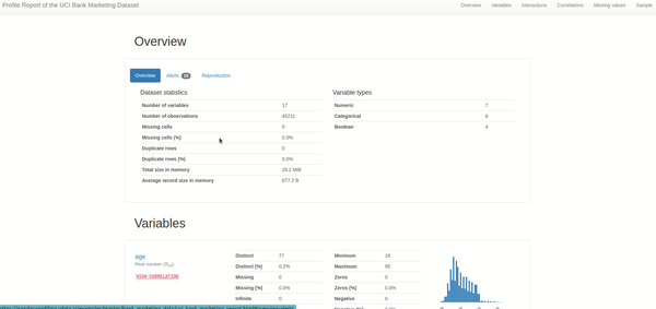
1. Overview of the dataset: This is the most helpful section when understanding the data at a glance. We need to keep an eye on the alerts section as we dig further into each alert when we start cleaning the data.
2. Variables or columns: an overview of statistics for each column in the data, such as mean, max, min, distinct, quantile, and histogram plot.
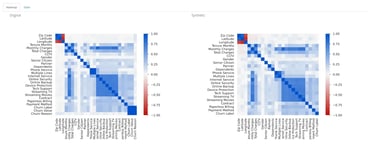
3. Interactions & correlations between variables:While it's essential to understand each column alone, machine learning is all about correlations and interactions between variables. These two interactive plots give us an idea of the interaction patterns between the variables and several correlation metrics such as Pearson's, Cramer's, and Kendall's correlation scores.
4. Missing values:This section is a savior to most data scientists who find poor data quality the biggest pain in the data science development lifecycle. In addition to the alerts we saw in the overview section, this part shows the number of missing values in each column. Generally, I refer to these columns to either impute or drop the columns during data cleaning.
5. Sample: Nothing fancy, just the first and last ten rows of the data, in case you'd want to have a look.
6. Duplicate rows: When duplicate rows are present, the reports list all the duplicated rows in a table. Crucial, from the data quality perspective.
As a standard user, you'd be good to go with the above. Remember that data profiling isn't the final step but a preliminary step to kickstarting your in-depth understanding of the data.
Typically after the initial profiling of data, I'd take a careful look at the alerts to see if any data quality issues are raised and require me to clean the data. I'd analyze the data distribution and plot variations of different variables against the target column.
If I see a pattern on the plots, I will try to validate the hypothesis through any statistical test. The idea would be to uncover as many insights from the data to solve the data science problem.
Advanced Usage of Pandas Profiling
When you start using the library foreveryproject you work on, you want to use the advanced features available within the library. The ones I've used and found useful are:
1. Minimal Mode for Data Profiling
Pandas Profiling includes a minimal configuration file where the most expensive computations, such as correlations and interactions between variables, are turned off by default and display the most important overview and variables section.
First, let's see how we can use this feature.
You might be wondering why we would even use the minimal mode. Here's why I had to and why you might want to.
Larger datasets:This is how I discovered this feature, as it's the recommended step from the package when large datasets take too much time to create the output. This feature would be helpful if you're working on a regular laptop or unable to scale compute resources. It cuts down all the compute-intensive operations and gives a simpler version of the report to get us started.
When we are only interested in features involving variables:The data is not always used for machine learning modeling purposes but also for data analysis, data pipelines, business reporting, etc. If correlations and interactions between variables (usually compute intensive) aren't required, why not stick to the minimal mode?
Creation of business rules and expectations based on univariate data analysis:Businesses often must set up rules and expectations for better data quality management. In such scenarios, it's easier to go with the minimal profiling version. The computation adds up significantly if several departments require to do this exercise.
2. Handling Sensitive Data
With several privacy regulations in place, sharing data reports that include a data sample (as shown in the recording above) may not be feasible.
In such scenarios, Pandas Profiling provides a configuration where only aggregated data information is added to the report, and no individual records are seen.
Here's how you can able the sensitive mode while generating the report:
Of course, this doesn't guarantee privacy, so we still need to inspect the report if we're to share it externally.
For instance, if the data has only duplicate rows, the aggregated information can still leak individual records. To combat this, we can drop the samples and duplicate rows from the report in our second run of creating the report.
As a disclaimer, I'd add that privacy and data sharing can be tricky, so please don't forget to check thedocumentationbefore relying solely on the library.
3. Using the Dataset Metadata Features
After we have completed our data exploration phase, we might want to share it with our team or even showcase it online. The dataset metadata feature doesn't help much in our data analysis but in how wesharethe report post-analysis.
In addition to references to the dataset and links to it, we can also transfer the variable descriptions from the data dictionary to a separate tab under the overview section.
Here's how you can do this for the Marketing dataset we picked earlier:
See how the data descriptions have been copy-pasted and live within the report, making it easy for anyone to review.
Here's how the variables tab of the report looked:
This step wasn't helpfulwhenI was doing the analysis, but it certainly was when I had to return to a project for model retraining after about six months.
4. Customizing the Metrics and Appearance of The Report
As our data science team matures, we establish ways on which metrics are essential for a particular use case, what color palette should be when sharing reports, and so on. You can explore more about the available customizations fromthis documentation page.
For example, you may only evaluate Pearson's coefficient and not require the remaining correlation metrics. Hence simply disabling the rest would save a lot of repetitive computations. You may also want to change the metrics thresholds, above which an alter is created.
Final Thoughts
It continues to fascinate me the power of open-source and how much these tools make our data scientist's life easier.
If there's something I'd like you to take away is to explore more open-source libraries: they're built by people like you and me, who know the pain points of the data scientists and work towards making their lives easier.
I hope this article gave you an idea of such an open-source tool and how you can use it.
I know there could be more features of Pandas Profiling that I'm yet to explore. What are some less-known advanced features you'd like to add? Let's share knowledge in the comments.