Generating synthetic versions of complex time series data
As we saw in our previous post, YData Fabric’s time series synthesizer works well for univariate, single-entity datasets, regardless of how complex the processes generating those datasets are. In those situations, only a single variable is being measured and the only relationships that can be measured are between the value of the variable and its prior values, also known as autocorrelation. However, in real datasets, we rarely only measure a single variable.
As discussed in “Trade-offs and best practices while synthesizing sequential data”, a time series dataset is typically composed of some combination of:
- Variables that give the order of time (such as a date, timestamp, etc)
- Variables that are time-variant (like the single variable that we synthesized in the previous post)
- Variables that refer to entities (e.g. if you’re measuring heart rate, each patient is a separate entity, so a variable could be “Patient ID”
- Variables that are attributes of the entity (continuing our heart rate example, the patient’s age)
Not only is the YData Fabric time series synthesizer effective at synthesizing complex, single-variable datasets, but it’s also good at synthesizing multivariate datasets. To demonstrate this, I created a multi-variate dataset.
Although in the previous post I intentionally kept the variable in question vague (it could have been anything from power production to hospital visits), in this case, I found it easier to create a more specific hypothetical situation. I generated a dataset to represent a hypothetical consumer’s daily spending, which I defined as being a function of their salary, whether it was a sunny day, and some randomly generated noise.
The synthesizer was able to capture not only the seasonality present in the data, it also picked up on the relationships between the two independent variables (whether it was a sunny day and the salary) and the dependent variable, generating a dataset that was consistent with the relationships in the original dataset.
Since this blog post relies entirely on the YData SDK, you can follow along by creating a free account, generating your own SDK token, and plugging it into the corresponding notebook for this series.
Creating baseline data
Before testing the synthesizer, we have to create our baseline data. As mentioned above, we’re going to create a dataset with four variables:
- The day (which will just be the index)
- Whether the day was sunny (which will be sampled from a Bernouli distribution, with seasonality so that there are more sunny days in summer and fewer in winter)
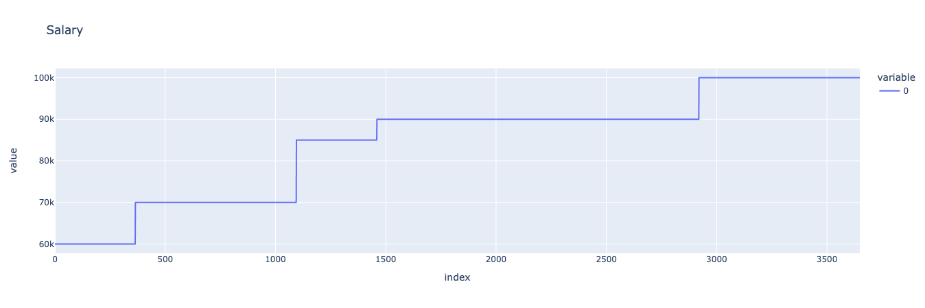
- The salary (which will be a manually-defined stepwise function)
- The amount of money spent on that day (which will be a function of all three variables, as well as some annual seasonality and some noise)
Let’s start by defining our “sunny” variable.
Sunny
To define our “sunny” variable, we’ll need to import the Bernoulli distribution from SciPy. Once we’ve imported that function, we can generate a value that represents how far away a particular day is from the 182nd day of the year. Plugging this into the Bernoulli distribution, we get a seasonally-affected variable with some randomness.
We can then visualize our variable to confirm that it mostly has sunny days in the summer and non-sunny days in the winter.

Salary
For our hypothetical consumer’s salary, we can define a simple stepwise function by combining a series of lists representing the consumer’s salary on each day. We’ll pretend that the consumer gets salary raises every year, every two years, or every four years, and arbitrarily define when those raises happen and how large they are. We can then visualize the resulting stepwise function.
Noiseless model
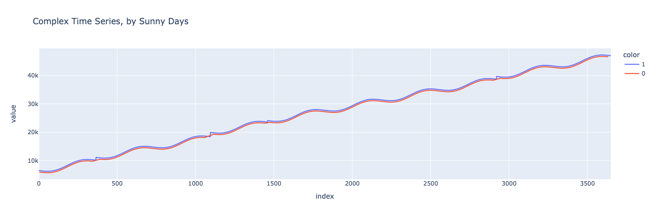
First, let’s generate a simple noiseless model to see what our trends look like. Our noiseless model is just a sum of a linear trend and annual seasonality (defined in the first post) and the sunny and salary variables. All of these are scaled by multiplying or dividing them by some constant.
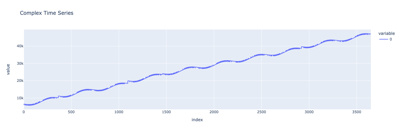
Looks good! We can see our linear trend in how the consumer’s spending increases over time, along with yearly seasonality. Looking closer, we can see stepwise bumps that represent the consumer’s spending increasing alongside their salary, as well as small hills and valleys representing the effect of whether it was a sunny day.
Next, let’s split the data into sunny and non-sunny days and visually inspect to ensure that sunny days are, on average, higher-spending than non-sunny days.
And now let’s repeat the same process for the different salary levels.
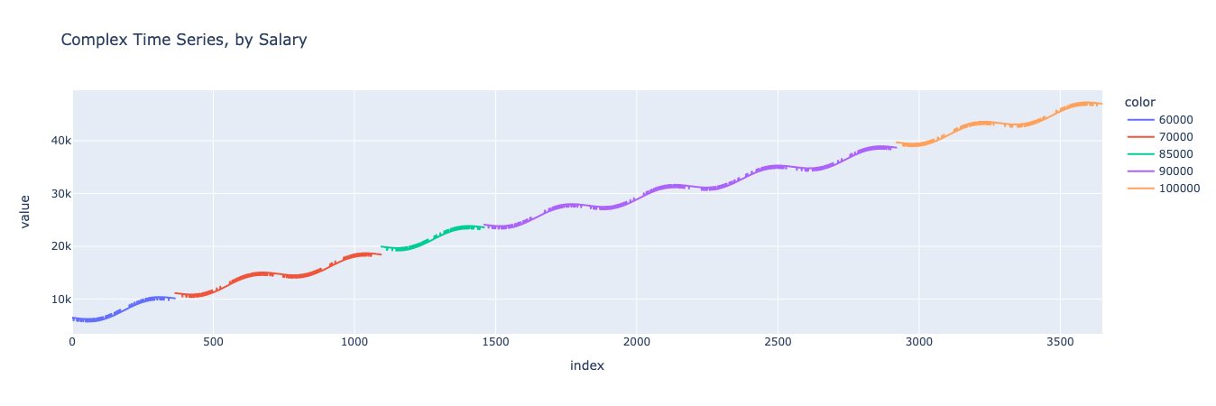
As we can see, in this simple model, the consumer’s spending increases over time, with yearly seasonality, affected by both the consumer’s salary and whether it was a sunny day.
Noisy model
But no model is complete without some noise. We can make our dataset more realistic by introducing some noise that’s correlated with the yearly seasonality.

There, this looks like a realistic, complex, noisy time series dataset. Now let’s train a synthesizer on it and see whether we can make another dataset that looks similar, retaining the relationships between the independent and dependent variables.
Synthesizing and compare
As before, we can use the TimeSeriesSynthesizer() function from the YData Fabric SDK to train a new synthesizer and then sample from. In this situation, since we want to generate a multivariate dataset, we’ll need to pass a dataframe that has all three variables that we want to generate.
After we’ve generated our synthetic dataset, we can compare it to the original dataset to confirm that it looks similar while not being identical. An easy and comprehensive way to do this is with YData Fabric’s Comparison Reports, which are automatically generated in the UI for any data synthesized in the platform.
We can take a look at the report to compare both summary statistics (min, max, mean, etc) as well as the PACF and ACF plots.


Looks good! We can see that not only do the data look visually similar, the autocorrelations and summary statistics are retained between the baseline dataset and the synthetic one. Now let’s take a look at the variables to make sure that their relationships are being maintained.
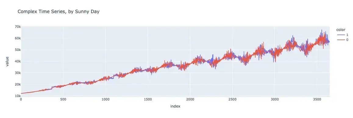
By Sunny day
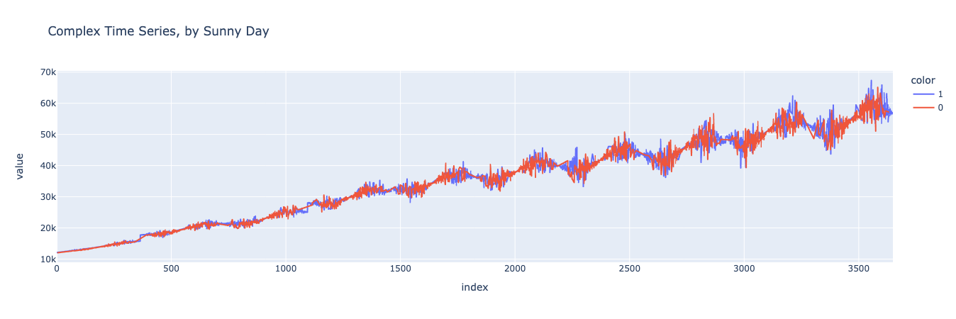
First, let’s generate a chart of our baseline dataset where the data is separated into sunny and non-sunny days.
And now let’s generate the same graph for the synthetic dataset.
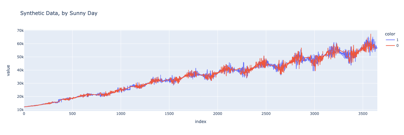
Looks pretty good! It’s easier to tell if you zoom in on particular subsections of the graph, but you can see that the spending on sunny days is higher than on non-sunny days, both in the baseline and synthetic datasets.
We can do this analysis analytically as well, finding the mean on sunny days and the mean on non-sunny days, finding the difference between the two, and comparing this value between the baseline dataset and the synthetic dataset.
Let’s start by finding this difference for the baseline dataset.
The mean of the complex, noisy function when sunny is 35493 and the mean of f6 when not sunny is 35006.
The difference is 487.
And now for the synthetic dataset.
The mean of the complex, noisy function when sunny is 35479 and the mean of f6 when not sunny is 35026.
The difference is 453.
This looks great! The means for sunny days, the means for non-sunny days, and the differences between the two are similar for the baseline and synthetic datasets! This indicates that our synthesizer has accurately modeled the relationship between the sunny day variable and the consumer’s spending.
By Salary
Now that we’ve established that the sunny variable is being accurately represented, let’s do a similar analysis for the salary variable.
We can start with a visual comparison of the dataset segmented by salary. First, let’s generate the chart for the baseline dataset.
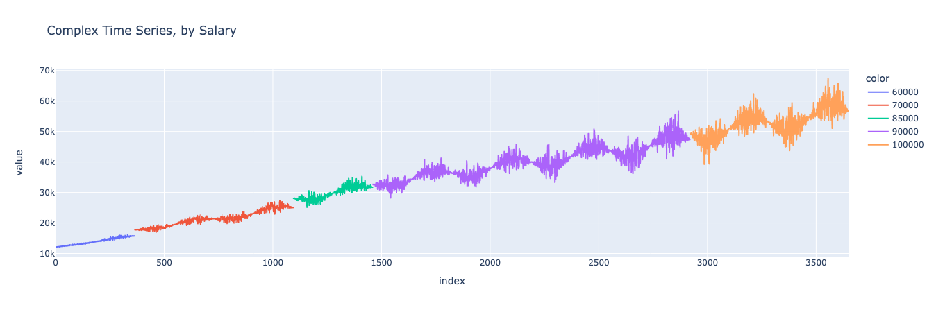

Looks similar! We can see that the model maintained the salary variable’s values and the jumps in spending that occur when the consumer’s salary increased, while not merely copying the previous dataset.
We can further confirm this analytically by isolating the salary increases and spending increases for both the baseline and synthetic dataset and confirming that the same relationship holds. Let’s start by finding the increase in yearly average spending in the baseline dataset.
And then find the increase in salary for each year in the baseline dataset.
And now, when we graph them against each other, we should see that on years where the salary increases (compared to the previous year), there is a corresponding increase in consumption. Conversely, on years where the salary doesn’t increase, the only consumption increase should be based on the linear trend, which amounts to around 3650.

Great, it looks just as we would expect. On years where the salary went up, the consumption did too.
Now let’s reproduce this same graph, this time for the synthetic dataset. If the synthesizer worked well, the graphs should look nearly identical.

And indeed they do! By comparing this graph with the one above, we can see that the same relationship between spend and salary was maintained in the synthetic dataset as in the original baseline dataset. This means that the synthesizer properly learned the relationship between the variables and was able to generate a new dataset that maintained that relationship.
Decomposition
Finally, we can decompose our dataset into its components, using the same decomposition that we used in the previous blog post in this series. If our synthesizer worked well, the decomposition charts should look similar for both the baseline and the synthesized datasets.
Let’s start by generating the chart for the baseline dataset.
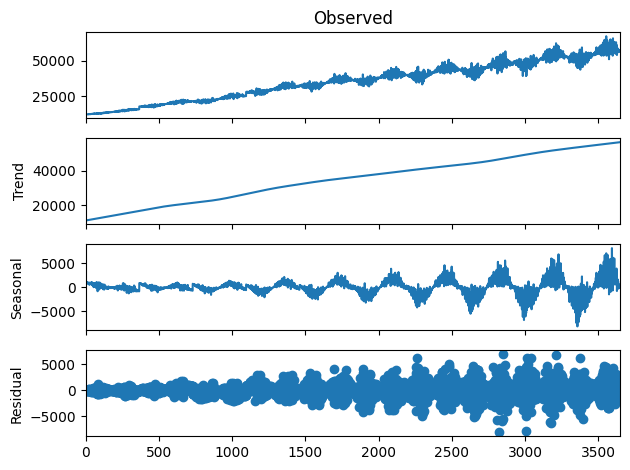

And again we can see that the charts are similar, indicating that the trend, seasonality, and residual components of the original dataset were all accurately preserved in the synthesized dataset.
Conclusion
As we’ve shown in this blog post, the YData Fabric Synthesizer captures correlated relationships between multiple variables, including for time series data. This is incredibly powerful for generating synthetic time series data, which otherwise can be a challenging endeavor. If you’re interested in learning more about how YData can synthesize time series data, in addition to this post, you can check out the previous post in the series and the post about using YData to synthesize transactional data.
Or, just check out the platform for yourself! You can sign up for free.