Generating synthetic versions of simple time series data
Time series data is all around us, from health metrics to transaction logs. The increasing proliferation of IoT devices and sensors means that more and more time series data is available to data scientists daily. This vast quantity of time series data has been a fruitful domain for machine learning, with forecasting, regression, and classification models all being trained on time series data or tabular data derived from time series.
However, time series data is also often highly sensitive. Healthcare and financial data are both incredibly valuable and highly regulated examples, but lots of other industries also have access to time series data that they have to be cautious about exposing, even to their own employees.
For tabular data, synthetic data has long bridged the gap between sensitive data and valuable machine learning models. However, synthesizing time series data presents its own challenges, since both the relationships between variables and each other as well as the relationships between the variables and time need to be preserved. Traditional techniques for synthesizing tabular data won’t work for time series data because they fail to properly model the processes that generate the data.
By taking a machine learning-based approach, YData has been able to help data scientists synthesize high-fidelity, privacy-preserving time series data. To demonstrate the capabilities of YData Fabric for synthesizing high-quality time series data, I’m going to create synthetic time series data that mirrors increasingly-complicated data, with both multiple seasonality and noise. As we’ll see throughout this post, the YData Fabric Synthesizer accurately models the functions that generate the data, creating new data that resembles the original, while preserving privacy.
In this first blog post, I am going to restrict myself to only looking at data with a single, time-variant feature. In the next blog post, I’m going to synthesize time series data on a dataset that has both a time-variant feature and multiple attributes, increasing the complexity of modeling the underlying process.
Since this blog post relies entirely on the YData SDK, you can follow along by creating a free account, generating your own SDK token, and plugging it into the corresponding notebook for this series.
Linear trend
Let’s start by taking the simplest possible time series function: a linear trend. When a variable increases linearly by a fixed value, we refer to this as a linear trend. Linear trends can be modeled with the famous equation “y=mx+b” where y is the dependent variable, x is time, m is the value that y increases by for every increase of x, and b is the value of y when x is 0.
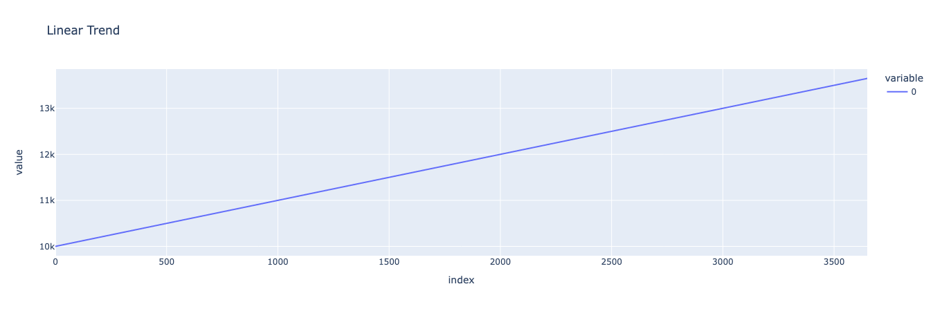
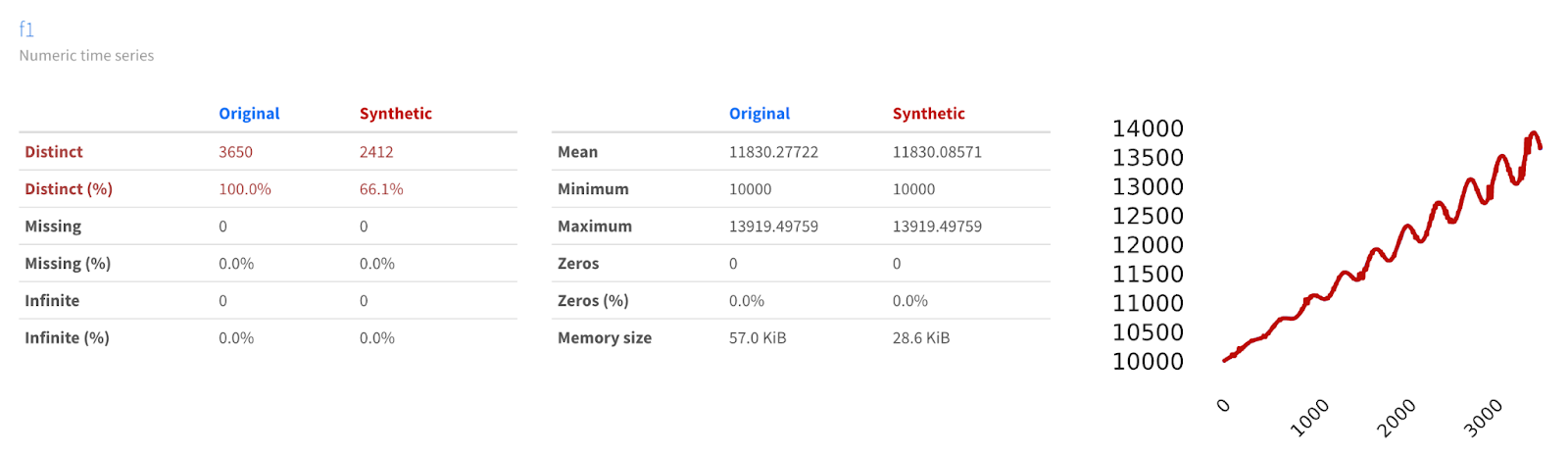
In this case, I’m going to create a very simple dataset where y increases by 1 for every increase in x, starting at y = 10,000 when x = 0. I’ll generate this dataset for 10 years (not including leap years), or 3650 days.
We can use Plotly to visualize our linear trend, which should just be a straight line that starts at 10,000 and ends at 13,650 after progressing through 3650 days.
Now let’s create a synthetic version of the same dataset and compare them against the original.
Which results in:
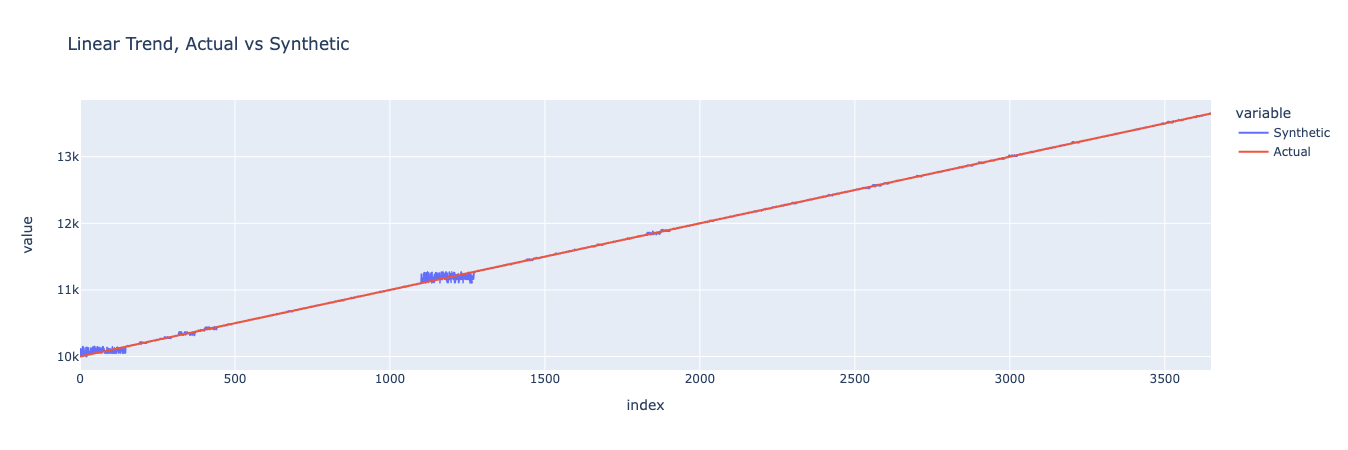
We can see that the synthetic data closely matches the original data, though with some jitter at a few points. Although this result isn’t very interesting because it could be replicated by adding some noise to our original function, it does point to the fact that YData’s synthesizers are able to model and produce new time series data that looks like the original without being identical. Let’s see what happens when we add more complexity.
Annual seasonality
We can the complexity up a notch by introducing some seasonality. In this case, we’re going to introduce annual seasonality, which means that our data should increase and decrease through 365-day cycles.
We can create a dataset with seasonality by using NumPy’s sin function. We’ll start by creating an array that represents the distance between each day and day 182 of that year (using the modulo operator in Python). We’ll take this array and multiply it by pi while dividing by 182, so that the values of our new array will range from negative pi to pi.
We can plot the result:
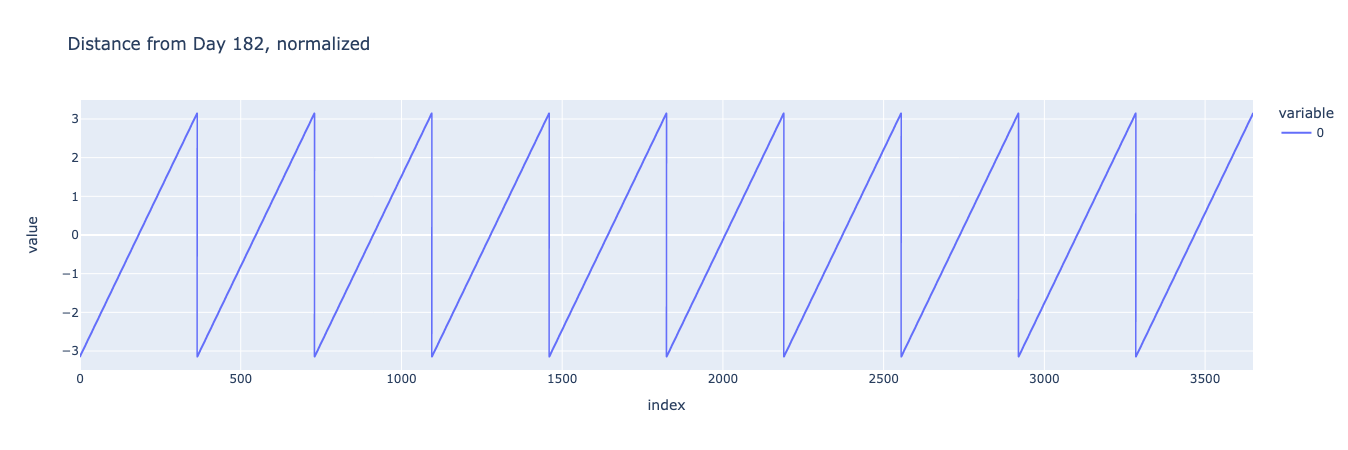
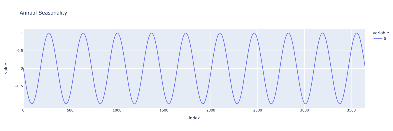
Since the sine of negative pi, 0, and pi are all 0, when we plug our array into the sine function, the beginning of each year, midway into the year, and the end of each year (which is the beginning of the next year) will all be value 0. Also, a quarter into the year and three quarters into the year will have the value of -1 and 1 respectively, which gives us a nice yearly seasonal curve:
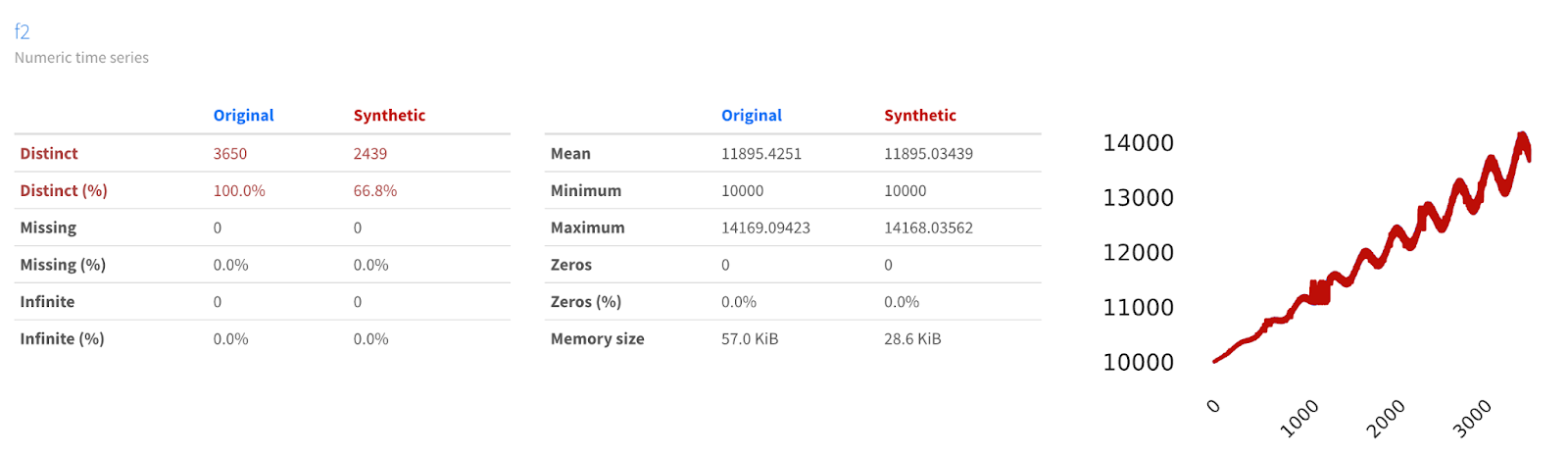
We can take this curve and add it to the linear trend we previously created to generate a dataset that has both a linear trend and seasonality. We’ll scale up the annual seasonality to make it more attractive:

This looks pretty good, but often seasonal effects get amplified by linear trends. We can create an interaction between the linear trend variable and the annual seasonality variable by multiplying them together rather than adding them. This time, we’ll scale the resultant effect down instead of up:

There, this looks great. Now let’s see whether YData Fabric can create a good synthetic replication of this data.
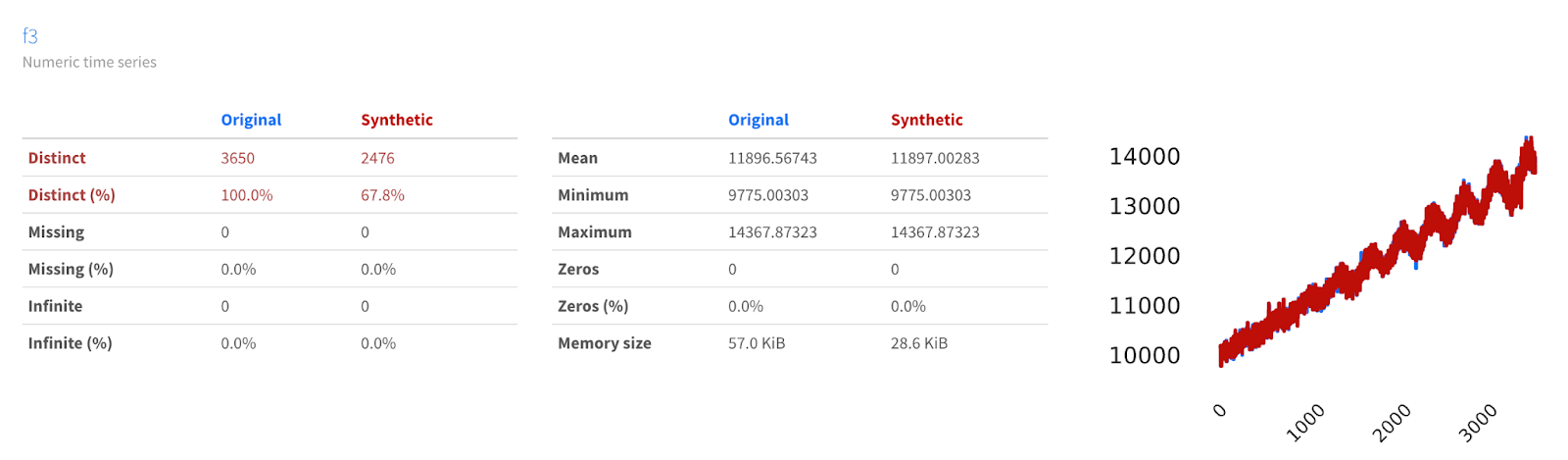
We can use YData Fabric’s Comparison Report for data synthesized on the platform in order to see how similar or different the data may be.
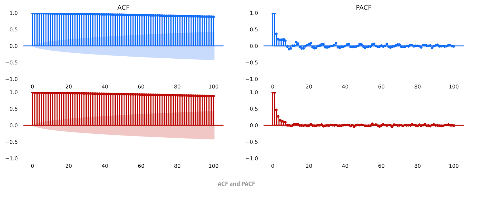
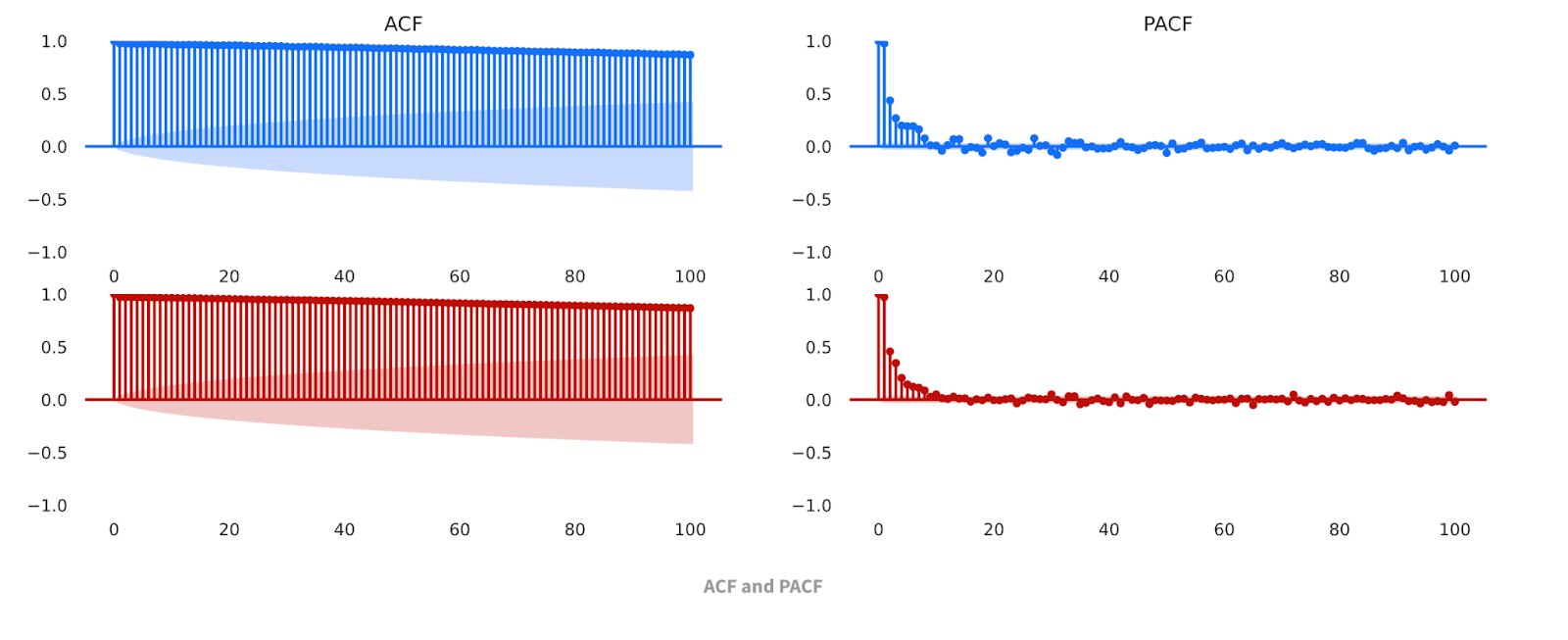
Here, we can see that the datasets are not just visually similar; the data share similar descriptive statistics, such as min, max, mean, etc. The Comparison Report also allows us to compare the Autocorrelation Function (ACF) and Partial Autocorrelation Function (PACF) charts for the baseline and synthetic datasets. These classic time series analysis charts are useful for further validating the similarities of the datasets.

Multiple seasonality
But annual seasonality isn’t the only type of seasonality that we can incorporate into our data. And, in fact, lots of datasets have multiple seasonal effects that impact the value of a time series variable. Additionally, not all seasonality follows the nice, smooth curves of a sine function. Let’s see how YData Fabric handles multiple seasonality and less smooth functions by adding weekly seasonality to our dataset.
We can generate weekly seasonality by again using the modulo operator. This time, instead of fitting our data to a sin curve, we’ll use a dictionary to map each day of the week to a value. I chose the first and last day of the week to have values 0, to represent no effect from weekends, while the days of the week all have different values ranging from 300 to 700. We can use list comprehension to quickly apply this dictionary to our initial array, thus generating a weekly seasonality effect.
Similar to the annual seasonality, we might want to amplify the effect of the weekly seasonality by multiplying it by the linear trend, and then scaling it down so that it doesn’t overwhelm the linear trend and the annual seasonality:

We can see that we’ve still got our annual seasonality and our linear trend, but that the curve now looks “fuzzier”, especially as time progresses. By zooming in a section of the graph, we can see how this “fuzziness” is actually a regularly-repeating weekly seasonality.
We’ve seen the synthesizer be successful at modeling a linear trend as well as a single seasonality compounded by that trend. What about multiple seasonality?
Again we can see that YData Fabric’s Synthesizer does a good job modeling the trends in our data, even when we add another seasonality to our time series, by looking at the Comparison Report in the YData Fabric UI.

Since we’ve confirmed that the synthesizer can deal with both multiple seasonality, let’s continue adding more complexity to the model.
Simple Noise
Even with the “fuzziness” introduced by the non-sinusoidal weekly seasonality, the dataset is still missing something important: noise!
YData Fabric has been performing exceptionally well so far at synthesizing data produced by a deterministic function. But data in the real world rarely looks so clean and periodic. I’ll leave it to greater minds than my own to determine whether the universe is ultimately deterministic (a la Einstein's “God doesn’t play dice”) or probabilistic (a la the Copenhagen interpretation). Regardless of which view of the universe you hold, when we can’t get perfectly precise measurements of every independent variable that could potentially impact a dependent variable, it turns out that including a stochastic or “random” variable in our model can be powerful.
Let’s start by adding some simple noise, taking observations from a normal distribution, and adding them to our model.
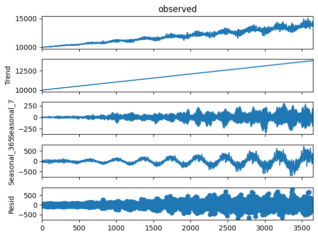
This results in a “messier”-looking dataset, because the noise moves the value up and down independent of the regular linear trend and seasonal effects. We can still clearly see our yearly effect and linear trend. Unfortunately, the signal from our weekly effect has mostly been overshadowed by the noise that we’ve added. We can apply Multiple Seasonal-Trend decomposition using LOESS (MSTL) to the dataset and get a more analytical understanding of how our resulting curve looks.
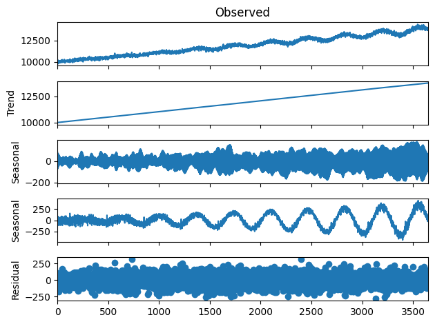
As we can see, we can decompose the data into a trend curve, a weekly seasonality curve, a yearly seasonality curve, and a residual (representing the noise). Our synthetic data should look similar, both overall and when decomposed.
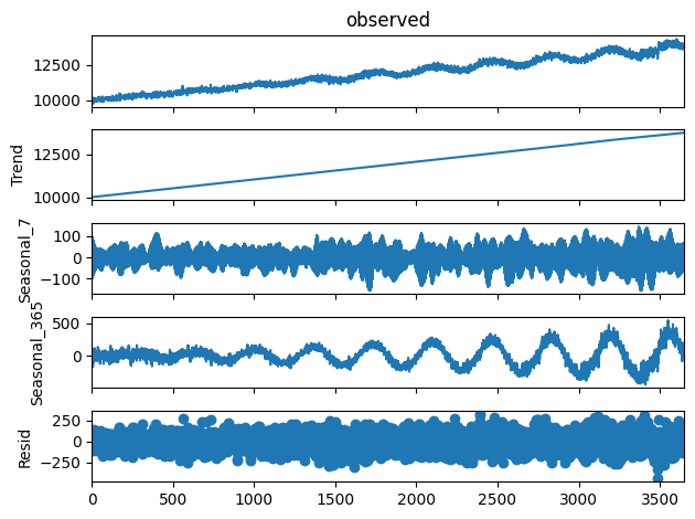
We can see that not only do the curves visually appear similar, but their decompositions are also more or less identical! This is strong analytical evidence that the time series synthesizer is doing a good job of modeling the function and generating new data from it.
Correlated Noise
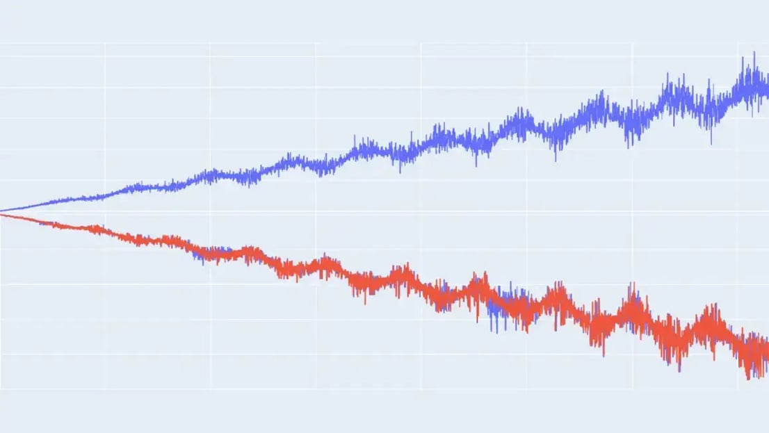
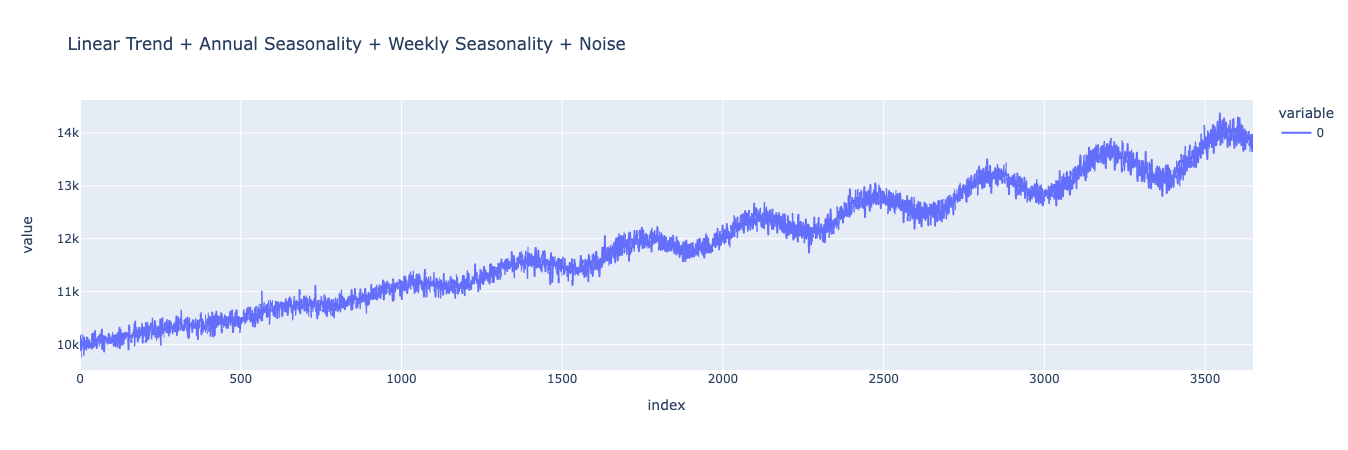
Our previous dataset looks good, though it’s still a bit simplistic. Often, real world data has noise and errors that are correlated with other variables in the model and which grow as the output of the model grows. We can imitate this ultimate level of model complexity for a single variable model by introducing more noise into the equation, and multiplying that noise by the seasonalities we introduced before. This will create a dataset that is truly representative of many real world phenomena.
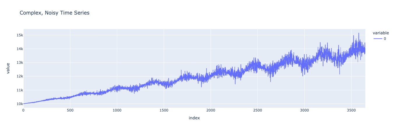
Look at that beautifully complex and multi-faceted curve. Looking at it, we can see how the level of noise and variability increases as the values grow, a function of multiplying the noise by the seasonality and linear trend. Just like with our simpler noise model, we can decompose the various components of the dataset and then compare that decomposition to a decomposition of our synthetic data.
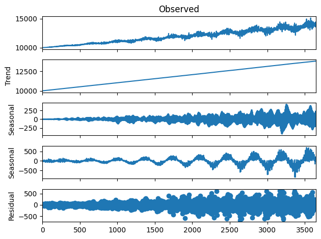
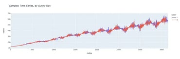
Now let’s synthesize data based on this dataset and see how it compares.
As we can see, not only does the synthesized data look substantially similar to the original data (while maintaining enough difference to be treated as anonymized), it also captures the various components of the original data. This means that we can confidently say that the synthesizer has effectively modeled our original function since it’s able to produce new data that follows the same trends and has the same seasonality as the original.
Conclusion
Throughout this post, we’ve seen and demonstrated how YData Fabric’s Synthesizer can be used to generate time series datasets that maintain privacy without sacrificing predictive power. By accurately modeling increasingly complex functions, the synthesizer is able to make novel data that can be used for training machine learning models, analyzing trends, and more.
In this post, we’ve stuck to the relatively simple case of a single-variable, single-entity dataset. While this type of data is useful, it’s not as complex as multi-variable, multi-entity datasets. With that in mind, check out the next post in this series on time series data, where we accurately synthesize an even more complex dataset.