As Synthetic Data becomes a must-have for the future of AI, guaranteeing its quality becomes indispensable. Fidelity, one of the main pillars of synthetic data evaluation, is crucial in ensuring that synthetic datasets accurately represent the real data.
In essence, fidelity concerns the ability of the new artificial data to preserve the original data’s properties — it refers to “how faithful” or “how precise” is the synthetic data when compared to real data.
In this blog post, we'll discuss the role of visual evaluation techniques and statistical measures in evaluating the fidelity of your synthetic data.
Visual and Statistical Techniques to Assess Fidelity
To determine whether the synthetic data can retain the same statistical information, correlations, and properties as the original data, Fabric allows user to assess the fidelity of their synthetic datasets through interactive and insightful visualizations, and statistical indicators.
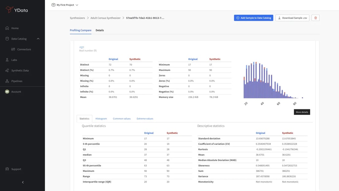
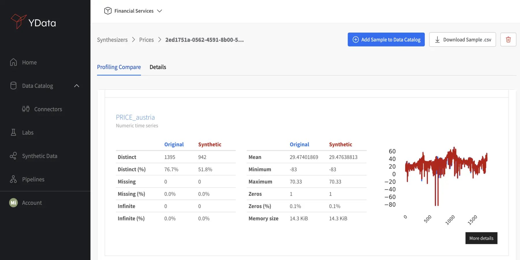
General Statistics
A best practice when evaluating your synthetic data quality is to determine how close the synthetic data’s statistical descriptors match the original data.
High-quality synthetic data should return similar indicators to the real data: mean, median, standard deviation, and quantile values:

These metrics provide a fundamental overview of the central tendency and variability of the data: a significant deviation from the statistics of real data could indicate potential issues with the synthetic dataset, which would require a closer inspection of the generation process.
Histograms
Histograms provide a visual representation of the distribution of data and are the most straightforward way to visually compare how close the distribution of synthetic and real data is.
When comparing the histograms of synthetic and real data, high-quality synthetic data should exhibit similar patterns to the real data: their shapes, peaks, and spreads should have the same structure:
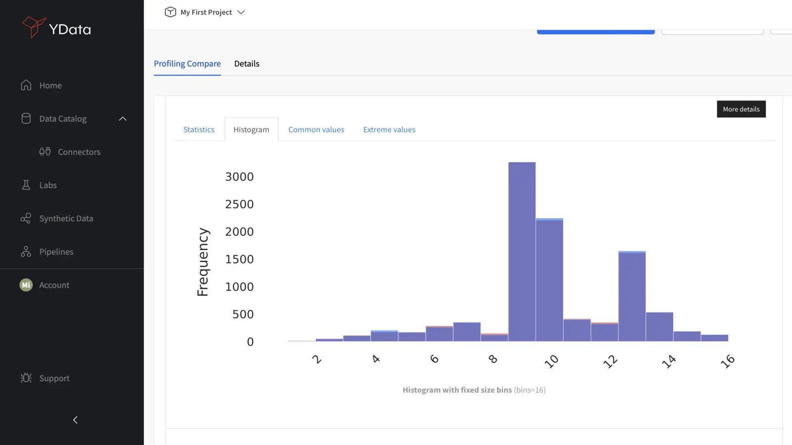
A close match in distribution patterns is crucial for ensuring that the synthetic data accurately represents the underlying structure of the real-world data.
Line Plots
Line plots and very effective in assessing time-series data. Realistic synthetic data should keep the same behavior as the original data, including seasonality, trends, and other observations. By comparing both plots in synthetic and real data over time, look out for any discrepancies that may impact the accuracy of predictions or analyses. High-quality synthetic data should faithfully capture the dynamic aspects of the real-world data.
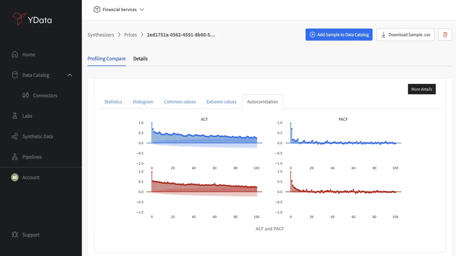
ACF and PACF Plots
Similarly, Auto-correlation function (ACF) and partial auto-correlation function (PACF) plots are critical for assessing time-series dependencies. Comparing these plots for synthetic and real data helps verify that the temporal relationships are accurately replicated, confirming the reliability of the synthetic time-series data.
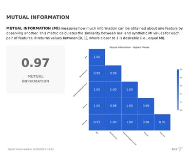
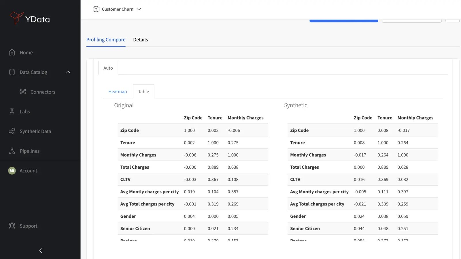
Correlation Plots
Correlation plots reveal the relationships between different variables in data. Ideally, high-quality synthetic data should mirror the existing correlations in real data in order to maintain the integrity of relationships within the dataset:
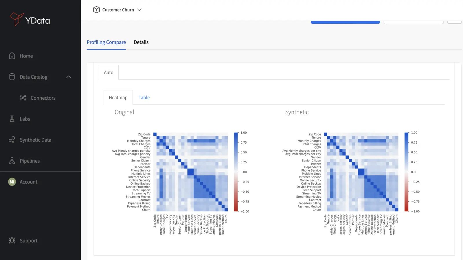
You can also compare the correlation matrices directly to determine whether the inter-variable relationships of the real data were kept. Significant deviations from the original correlation matrix may highlight some inconsistencies in capturing the complexity and behavior of the underlying data, and therefore the synthetic generation process should be revisited;
Conclusion
When assessing the quality and validity of your synthetic data, a crucial step to start with is investigating the fidelity of the new data.
Assessing fidelity will provide you with an overall view of how closely the newly generated data matches the original data, and how much diversity has been preserved in the new sample. In other words, it will give you a detailed idea of how realistic and diverse your synthetic data really is. However, fidelity is not the only component to address when evaluating synthetic data. Learn more about how to evaluate synthetic data quality.
Furthermore, the synthetic data generation approach should always be tailored to your specific use cases and there might be some trade-offs to consider.
If you’re starting out with synthetic data generation, try out Fabric Community Version and don’t hesitate to reach out to our specialists with further questions about how to achieve high-quality data for your AI projects.
For additional information and more learning resources, feel free to stop by the Data-Centric AI Community and connect with other data scientists working in the field.