How to Leverage Data Profiling for Synthetic Data Quality
Leverage EDA to beat GANs challenges
Machine Learning has mainly evolved as a model-centric practice where achieving quality results is left pending small data processing efforts and instead concentrated on experimenting with families of models and performing exhaustive parameter tuning routines. Realizing the need for wholesome ML, the data-centric approach has emerged and attempts to put data and data quality back in the main stage.
The main reason for this shift is simple, while good models are important, so is the data used. As the adagio of Computer Science says, “Garbage in, garbage out”, would we expect data used in ML to be any different? While good models and good data are often task-dependent, good data is typically more scalable since effective data preprocessing should serve not one but a multitude of ML tasks, translating to shorter iteration cycles towards the desired results and yielding benefits compounding across multiple projects.
Have you ever tried or experimented with Generative Adversarial Networks for data synthesis on a dataset of choice and wondered how you would guarantee the quality of the produced data?
You would have good reasons to be concerned about it since, indeed, the literature points to a multitude of difficulties of GAN learning:
Mode collapse – A special kind of overfitting where the model tends to output very similar outputs no matter what input it is given
Train instability – Often, non-overlapping support of the produced samples distribution and the samples provided to the discriminator lead to unstable training, which can completely jeopardize model learning
Complex convergence dynamics – Both the Generator and the Discriminator can behave optimally in practical terms and lead to different undesirable results. The ideal balance is a balanced match of both models, but there is no straightforward way to ensure that this occurs.
As if the above points were not enough, in the end, GANs are still a black-box model. Input is fed to the model, and the output can be retrieved in the intended format. However, that barely scratches the surface of what it means to have synthetic data with good quality.
If you have ever experimented with creating synthetic data, then you probably have thought about this problem; we can summarise it with the following dilemma:
There are many aspects of synthetic data that are related to its quality, so you want to be thorough
Performing a deep analysis can be very time-consuming, and you don’t want to be too long on this step
Having the best of both is tricky; this is where open-source packages can be of use. These can help you get to your results faster and often teach you new effective ways to handle old pains.
In this article, we will show you how to integrate the Data Profiler package on a ydata-synthetic project. ydata-syntheticis an open-source Python package that provides a series of generative model implementations for tabular and time-series data synthesis. Data Profiler is an open-source solution from Capital One that uses machine learning to help companies monitor big data and detect private customer information so that it can be protected. By combining these two packages you can easily synthesize data and profile it to assess the quality of the generated data.
When assessing the quality of the synthetic outputs we could focus on combinations of the following aspects:
Privacy, does the generated data include any sensitive information? (Names, addresses, combinations of features that can make a real-world record identifiable)
Fidelity, how well does the synthetic data preserve the original data properties? (Marginal distributions, correlations)
Utility, how well does the synthetic data behave when put into use in a downstream ML application? (Train Synthetic Test Real, Feature importance distribution comparisons)
For this study we are concerned with fidelity, to analyze it we will take the following steps:
1. Install DataProfiler and import required packages 2. Read a dataset 3. Profile the dataset 4. Data processing 5. Define and fit a synthesizer 6. Sample and post-process synthetic data 7. Profiling synthetic data and comparing samples 8. Saving/loading a profile for later analysis
We will cover basic DataProfiler usage in a data synthesis flow. We will focus the data pre-processing and its impact on the fidelity of the produced samples by leveraging Data Profiler and its outputs to understand what pre-processing leads to the best results.
1 . Install Data Profiler and import required packages
In this demo we will fire up a conda environment for called ydata_synth, install and use the slimmer version of Data Profiler to explore the utility aspect of our synthetic data.
Import all our required packages:
At this point if you are running a GPU in your system you might need to allow memory growth:
2 . Read a dataset
The dataset that we will use in this demo is a sample from the popular cardiovascular disease dataset. This is an open dataset, so you can easily downloaded and add into a folder in your project location.
We produced this sample by cleaning out some outliers that are extremely unlikely or even physically impossible by enforcing the following conditions:
Diastolic (lower) pressure must be bigger than 0
Systolic pressure (higher) must not be bigger than 240 (above hypertensive crisis)
Diastolic pressure must be lower than the systolic blood pressure values
By applying these criteria we filtered out roughly 1.9% of the records and made the sample much more representative of a real population.
Cardio dataset sample
3 . Profile the dataset
To quickly learn more about our data, we can have a look at what Data Profiler can provide.
The Profiler is the main class that unlocks data analysis.
Depending on the passed data object either an UnstructuredProfiler, specialised for text data, or a StructuredProfiler , specialised for tabular data, will be automatically dispatched.
Creating a Profiler for the smoker sample is simple. There is a lot of information to unpack from this object, we will focus on what is most informative to our task.
From the global part of the report we can see that we have no duplicated rows, no missing values and also we get some general information about the dataset schema.
Despite not being necessary, in this case, a complete picture on missing data could be obtained with the Graph module’s plot_missing_values_matrix method. It’s output lets us know the prevalence of missing values, at which columns they occur and what are the inferred missing values.
The blue bars mean we have no missing data.
Let’s look at the feature level information and extract some more knowledge about the dataset.
Unpacking some of what we can see from this report:
Age seems to be provided as days
There are a lot of unique values for the age feature but, according to the descriptive statistics, it is not uniform or normal distributed
According to the samples values of ap_hi and ap_lo, this feature seems to be grouped as 10’s. However the number of unique values suggests the opposite
These are some useful insights for us to consider when preprocessing the data.
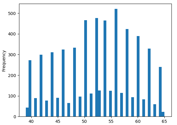
From the Graphmodule we can also get a glimpse of the empirical distributions of the features with plot_histograms.
These methods returnmatplotlib figures which also allows you to do some further customisation.
Now we also know the following:
Age,ap_hiandap_loseem to exhibit a strong multi-modal behaviour. We might want to discretise these features
Height and weight seem almost normal, but right-tailed, they can probably be reasonably well fit with a log-normal distribution
We will take these insights for the data preprocessing.
4. Data preprocessing
In the last section, by using the summary reports and plotted histograms, we have detected some feature distributions that probably will be hard to pick up by the GANs that we will use as synthesisers. Namely the multimodal distributions for the age and blood pressure features and the skewed tails of height and weight features. We will do a custom preprocessing flow to try to concentrate the information of our features so that the data relationships can be more easily picked-up.
Starting with some feature engineering:
For the age we will convert days to years and bin them in ranges of 5
Relative to the blood pressure values, rounding to nearest 10’s should also provide decent results, we have noticed that most of the values are actually already in this format. Also it is similar to way physicians read arterial pressure values on checkup consultations!
This preprocessing flow will leave us with a lot of categorical features. Categorical distributions aretricky to capture as well. In order to avoid modeling categorical distributions we will pass a dense representation of the data to the GANs. Some dimensionality reduction techniques from Scikit learn are suitable to obtaining a dense representation of the data.
To test the hypothesis that this additional processing step helps in GAN learning, we will split our flow in two and create two training datasets:
Only pre-processing the features as explained above
Applying a dimensionality reduction technique to the output of step one.
4.1 — Feature Engineering
Age Feature
Arterial pressure features
The code for the features extracted for the Artificial pressure related features can be found in this repository.
As soon as our GAN hyperparameters are set, we can train the model. For that we only need to provide the following inputs — the list with the available categorical and numericals columns, as per the code snippet below.
6. Sample and post-process synthetic data
With the fitted synthesizers we can obtain synthetic samples by leveraging the sample method. The sample method receives as an input the number of synthetic samples that you want to generate.
Nevertheless, right before our process of synthesis, we have performed some transformations and extracted some features. In order for the synthetic data to resemble the original one, we need to revert the applied transformations.
6.1 — Revert dimensionality reduction
We undo the changes applied to flow 2 first by inverting the NMF transformation and the pre-processing.
6.2 — Revert feature engineering
Both synthetic samples are in the same format. We need to undo the feature engineering step to put both in the original format.
Age
For age we can sample an integer uniformly within each range, add low scale normal noise and convert years back to days. This should return the spiky behavior we could verify in the real data.
Arterial pressure values
These features don’t need much, in the feature report analysis we got the suspicion that most of it is already rounded to the nearest 10.
Let’s validate from the whole dataset.
More than 95% of the real records are actually rounded to 0. We will use this information to simplify the post-processing.
Real data snippet
Synthetic data snippet
Now the synthetic data seems to be in the original data format.
The pre and post processing operations are summarised by the following diagram:
Data pre and post-processing diagram.
7. Compare sample profiles
To compare the synthetic and real data we start by creating a profile for the synthetic samples. We can use theplot_histogramsmethod to validate the quality of synthetic samples and get a preliminary inspection of the fidelity.
By inspecting the marginal plots, it seems that feature engineering + NMF flow produced better results and was indeed successful in preserving the categorical distributions of the real data while flow 1 is showing a tendency towards uniform distributions. The age values seem to not be capturing the centers of mass of the distribution so well. Probably the strategy of binning by 5, sampling and adding noise took away too much information and the sampling + noise addition strategy was not able to retrieve this behavior. It seems also that glucose feature must be representing only the majority class.
The diff method of the Profiler allows us to obtain a description of the differences between two data profiles, as long as they share the same schema. This allows us to get a glimpse of the similarities between two samples, a useful way to compare synthetic samples with the real data!
This output is very rich, we can unpack the following observations:
The distribution for age is indeed off, we can see that the average and median of the differences is actually significant, close to the equivalent of 6 years
The high blood pressure seems to be actually quite good, the standard deviation of the differences is around 6 in a feature with values ranging 80–220, also the mean and median of differences are close to 0
In glucose we can confirm the suspicion taken from the plots, the synthetic sample is a constant value as the fieldorderindicates. Well, choosing one at least it got the majority class right!
8. Saving/loading a profile for later analysis
Data Profiler also allows saving and loading profiles. This is another useful feature for your ydata-synthetic projects. To save a profile you can use the Profiler save method.
As an example, we can save the synthesizer and the synthetic data sample profile that we have just created and worry about sample evaluation or model selection after a batch of experiments.
Reloading data profiles with the load method is easy as well:
Conclusion
Data Profiler, from Capital One, has a set of tools that are good additions to your Machine Learning flows.
We have seen how we can get an overall and more detailed profile of our data via plots or rich dictionaries. We have also learned how to assess the missingness of the dataset.
To compare the quality of synthetic samples we used the diff method that provided us with a special type of Profiler directed at the differences of the two samples.
We learned that training the Wasserstein Generative Adversarial Network with Gradient Penalty in the dense representation seemed to yield results with higher fidelity than directly learning in the data space. There are many different strategies that could have been applied to preprocessing, Data Profiler was useful in testing the different possibilities.
This demo demonstrated the capacities of the DataProfiler package and how you can use it in the context of a ydata-synthetic project.
On a closing note, please consider yourself invited to the Data Centric AI Community, a community packed of data enthusiasts where you can find all data related issues. Waiting for you there is a lot of cool open-source packages; a Discord server where you can find knowledge, memes, job listings, events and much more or share your victories, losses, questions, meet people and engage in discussions.